

The New Broncos logo meaning didn’t stay confined to club announcements or marketing slides. It spilled instantly into group chats, backyard barbecues, workplace debates and junior footy sessions across Queensland. As the Broncos revealed their 2026 look—logo, jerseys and mantra—the reaction felt less like a design critique and more like a moment of shared community identity.
In Brisbane, the Broncos aren’t just a sporting team. They’re a weekly rhythm. They shape family rituals, school conversations and pub culture. So when the club changes how it looks, the ripple travels far beyond Suncorp Stadium.
How the Identity Shift Filters Into Everyday Brisbane & New Broncos Logo Meaning — Fan Snapshot Table
The rebrand entered public conversation long before its official release thanks to the IP Australia leak. Screenshots circulated everywhere: neighbourhood Facebook groups, WhatsApp parent-school chats, even local gyms where people paused mid-set to squint at the new shield.
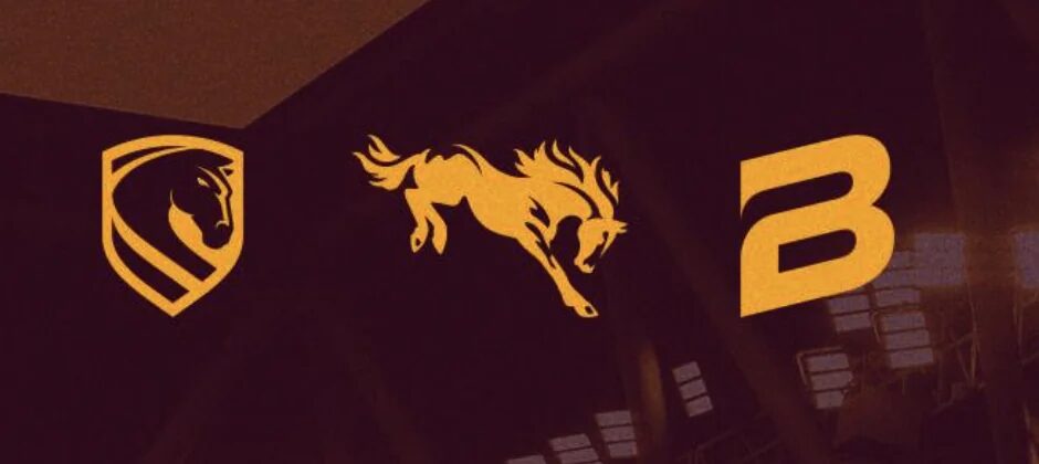
Kids pointed at the forward-facing horse and called it “more like a superhero.” Long-time fans argued over whether the river line looked intentional or “like a scratch.” And graphic designers in the community had a field day breaking down angles, shapes and symbolism.
New Broncos Logo Meaning — Fan Snapshot Table
| Community Reaction | What It Represents |
|---|---|
| “It looks cleaner.” | Younger fans associating the style with global sports brands. |
| “Where’s the old horse?” | Nostalgia from long-time supporters who grew up with the side-profile icon. |
| “Brisbane on the badge makes sense.” | Recognition of rising city pride ahead of the Olympics. |
| “Too corporate.” | Concern that minimalism removes character. |
| “It’ll grow on us.” | Fans acknowledging that identity shifts often take time. |
The table reflects a community trying to understand not just what changed — but why.
New Broncos Logo Meaning in Daily Culture: Jerseys, Streetwear & the ‘We Charge On’ Mindset
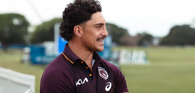
You can learn a lot about a rebrand by watching how fans wear it. The New Broncos logo meaning becomes clearer when spotted on school bags, gym singlets or bumper stickers. Some fans immediately embraced the shield because it pairs well with everyday outfits, making it feel more like wearable streetwear than a traditional club emblem.
How Jerseys Are Being Seen Around Brisbane
- The home jersey appears frequently in cafes and gyms, where its clean maroon-gold layout feels modern enough to double as casual wear.
- The Cyril Connell away jersey is being praised by older supporters who value Queensland’s rugby league roots.
- Collectors are already discussing whether the 2026 edition could become a “first-generation” item of the new era.
The Lifestyle Role of “We Charge On”
What’s interesting is how quickly the slogan has entered everyday speech. Parents shout it at junior footy games. Teachers use it jokingly with students. And fans on social media claim it “sounds like something you’d yell during a hill session at training.”
The mantra works because it’s adaptable — motivational without being overproduced.
How Brisbane’s Community Divides, Bonds & Laughs Through the Rebrand
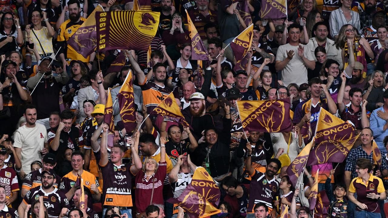
A sports rebrand often reveals the culture of a fanbase. And in Brisbane’s case, it has highlighted a blend of humour, rivalry and genuine emotional investment.
The Lighthearted Side:
- Memes comparing the new shield to superhero logos
- TikToks where kids review the emblem like fashion critics
- Fan edits merging the logo with Brisbane City Council signage
The Emotional Side:
- Supporters who feel the club has “grown up too fast”
- Older fans who remember foundation-year games and don’t want to lose that connection
- People who see the new identity as preparing Brisbane for its Olympic-era spotlight
At local pubs, the debate often turns good-natured: fans ribbing each other about being “traditionalists vs modernists.” At workplaces, people place printed versions of the logo on whiteboards and vote anonymously. Community identity plays out in real time.
The cost debate—around $300,000—sparked the usual talkback-radio discussions, but many fans acknowledged that modern clubs operate in a branding world far removed from the 1990s.
Conclusion: A Rebrand Shaped by the People Who Wear It, Not Just the Club That Created It – New Broncos logo meaning
Whether fans adore it, resist it or laugh about it, one thing is clear: the Broncos’ 2026 rebrand is already part of Brisbane’s cultural routine. The simplified shield, cleaner jerseys and “We Charge On” mantra show a club looking forward — but it’s the community response that determines how powerful the shift becomes.
Over time, the New Broncos logo meaning will be defined not just by design notes or marketing releases, but by how supporters wear it, share it and connect it to their lives. And in a city where rugby league is part of the social fabric, that meaning will keep evolving with every season.


